Note that you can also set the opacity and scale of the image. Of course, you'll want to optimize the file size of this image so as to keep Google Earth performing well.
You can set the icon in the KML source as well. Learn more.
Learn tricks and tips to explore your world more effectively in Google Earth.
 The Google Earth Help Center has many tips to help you successfully install Google Earth on your computer. Additionally, the Help Center has many troubleshooting tips that you can use to improve performance of the application.
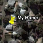
 When you create content in Google Earth (such as a placemark), this content resides on your computer unpublished until you decide to share this content with others. So if you mark the location of your home, no one can see this placemark until you explicitly share it with others.
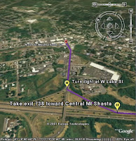
 Once you create a set of driving directions in Google Earth, you can follow a tour of these same directions.
 Often when I am demonstrating Google Earth, users will ask me why surface of the Earth often looks like a patchwork or quilt. Different areas are comprised of different colors and sometimes adjacent areas look completely different.
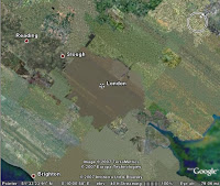
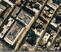
 It is also true that the more detail an image has, the more can it appear as brown or unrefined when viewed from a higher view point. This is particularly true of urban areas. A great example of this is the city of London. From a top down view from far up, London looks like a brown/green blob, but as you zoom in, you can see amazing detail.
 You may know that you can create compelling custom content for both Google Earth and Maps users with KML. But Google Maps for mobile users can also view this KML content on their mobile devices.
 I have published a new tutorial that describes how you can import addresses into Google Earth Plus, Pro and EC. With this feature, you can import spreadsheet (CSV) addresses and automatically create placemarks for each address that appear in Google Earth.