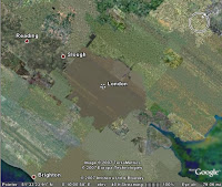
 Often when I am demonstrating Google Earth, users will ask me why surface of the Earth often looks like a patchwork or quilt. Different areas are comprised of different colors and sometimes adjacent areas look completely different.
This effect occurs because the imagery you see is made up of individual aerial images of the planet's surface. The images are often photographed on different times of the day or season, making them look disparate when they are stitched together and shown in Google Earth. For example, often images of a mountain range will show snow on certain slopes and in the adjacent region, peaks of similar elevation will have no snow at all.
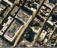
 It is also true that the more detail an image has, the more can it appear as brown or unrefined when viewed from a higher view point. This is particularly true of urban areas. A great example of this is the city of London. From a top down view from far up, London looks like a brown/green blob, but as you zoom in, you can see amazing detail.
3 comments:
How do get the map to tune in, or adjust detail??
Steve, you learn about this in the Google Earth user guide:
http://earth.google.com/userguide/v4/
John, please be aware that the word "comprised" is used incorrectly in your post. Examples of correct usage: "the United States of America comprises fifty states", or "the United States of America is COMPOSED of fifty states".
Thanks for putting together the great blog. Please keep it up!
Post a Comment